
Yield Analysis
Visualize yield percentage per batch as a scatter plot, identify technician and formula yield patterns, and export data for trend investigations in Clarix.
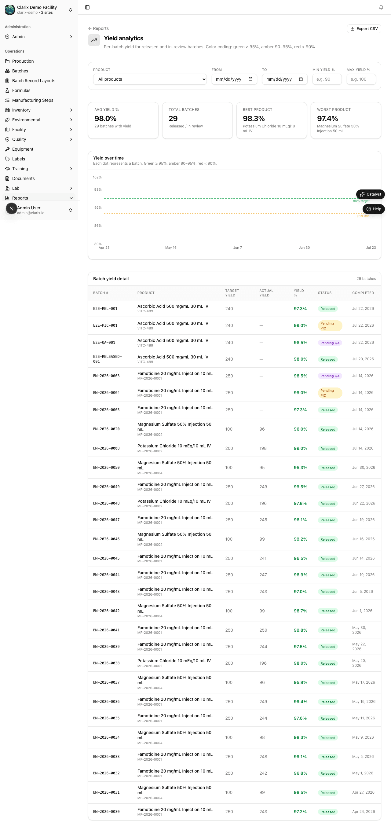
The Yield Analysis report provides a batch-level scatter plot of yield percentages, giving your QA team the most granular view of yield performance in Clarix. Navigate to Reports → Yield Analysis to open the report. While the Batch Analytics report shows averages and volume, Yield Analysis shows you every individual data point — making it the right tool for identifying outliers, investigating technician-specific patterns, and demonstrating yield consistency to an FDA investigator.
Role required: QA Technician or higher. The Export CSV button is available to all users who can view the report.
Reading the scatter plot
Each point on the scatter plot represents a single completed batch. The x-axis is the batch completion date and the y-axis is the yield percentage for that batch. Points are color-coded into three performance bands:
| Color | Range | Interpretation |
|---|---|---|
| Green | ≥ 95% yield | Target performance — batch met or exceeded the expected yield |
| Amber | 85–94% yield | Watch zone — yield is acceptable but below target; investigate if recurring |
| Red | < 85% yield | Investigate — yield is significantly below target; a deviation may be required |
The color coding is consistent with the yield thresholds defined in Clarix business rules. If your organization has customized the yield warning threshold (under Settings → Business Rules), the scatter plot color bands update automatically to reflect your current thresholds.
Hovering for batch detail
Hover over any point on the scatter plot to see a tooltip with:
- Batch number (e.g., BN-2026-0112)
- Formula name and formula number
- Technician who executed the batch
- Actual yield % (two decimal places)
- Theoretical yield in grams or units
- Completion date
Click the tooltip to navigate directly to the full batch record for that batch.
Filters
The filter bar lets you narrow the scatter plot to specific subsets of your production data:
- Date range — Set the time window. Defaults to the past 90 days.
- Formula name — Filter to batches of a specific formula. Essential when investigating whether yield problems are formula-specific or facility-wide.
- Technician — Filter to batches executed by a specific technician. Useful for identifying whether a yield pattern is tied to an individual operator.
Combining filters helps you isolate patterns. For example, filtering to a single formula and a single technician will quickly reveal whether that technician performs differently on that formula compared with their peers.
Identifying yield patterns
Yield Analysis is most powerful when used to answer specific investigative questions. Common patterns and how to find them:
Is a particular formula consistently yielding below target? Filter by formula and look at whether the majority of points fall in amber or red. Compare with other formulas to determine if the issue is formula-specific.
Is one technician's yield worse than others? Run the report unfiltered for a period of at least three months. Note technicians whose points cluster in the amber or red zones. Then filter to a single technician to confirm the pattern. If confirmed, this is evidence for a training intervention.
Has yield declined over time? Look at the scatter plot without filters. Draw a mental trend line from left to right. If newer batches (on the right) cluster lower than older batches, there may be a drift in equipment calibration, raw material quality, or procedure adherence. Use the date range filter to compare two equivalent periods (e.g., Q1 2025 vs Q1 2026).
Are outlier batches linked to specific lots? Click on any red point to navigate to the batch record and check which raw material lots were used. If multiple red-zone batches share the same lot number for a key ingredient, flag that lot for review.
Exporting yield data
Click Export CSV to download all yield data currently displayed on the scatter plot. The export includes one row per batch with columns for batch number, formula, formula version, technician, completion date, actual yield %, theoretical yield, and the color band (Green/Amber/Red) for easy filtering in Excel or your data analysis tool.
Note: If you are preparing for an FDA inspection, export yield data for the past 12 months (or the full inspection period). Investigators frequently ask to see yield trending as evidence of process control under 21 CFR Part 211. Having a pre-exported file ready demonstrates preparedness.
Related pages
Batch Analytics
Understand batch volume, average yield, rejection rates, and release velocity over time using the Batch Analytics report in Clarix.
Quality Metrics
Track deviation and CAPA counts, severity breakdowns, source analysis, and open vs. closed trends for QA review boards and corrective action effectiveness in Clarix.